7 Pro Tips To Design Your Perfect Certificate Now

1. Understand the Purpose and Target Audience

The first step in designing a certificate is to clearly define its purpose and identify the target audience. Certificates serve various functions, such as recognizing achievements, commemorating events, or providing official documentation. By understanding the intended use and the recipients, you can tailor the design to meet their expectations and convey the right message.
For example, if the certificate is for a sports tournament, consider incorporating elements that reflect the sport or the event’s theme. On the other hand, an academic certificate may require a more formal and elegant design to reflect the seriousness of the achievement.
2. Choose an Appropriate Layout and Size
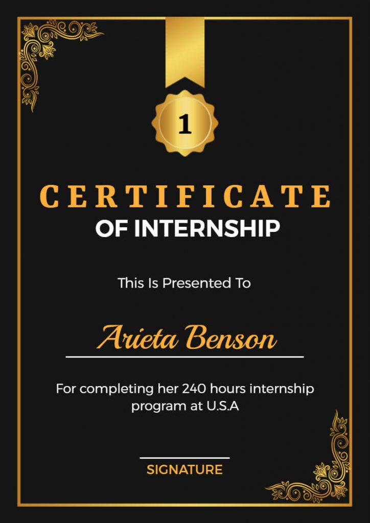
Selecting the right layout and size for your certificate is crucial to ensure readability and visual appeal. Consider the amount of information you need to include and choose a layout that allows for clear and organized content placement.
A standard certificate size is typically 8.5” x 11” or A4, but you can also opt for larger or smaller sizes depending on your design and printing preferences. Remember to leave sufficient margins and consider the fold lines if the certificate needs to be folded for mailing or storage purposes.
3. Select a Professional and Attractive Font

The font you choose for your certificate can greatly impact its overall look and feel. Opt for a font that is easy to read and professional. Avoid overly decorative or script fonts that may be difficult to decipher, especially for older recipients or those with visual impairments.
Consider using a combination of fonts to create visual hierarchy and emphasis. For instance, you can use a bold or italic font for the certificate title and a slightly smaller font for the recipient’s name and other details. Ensure that the font sizes are large enough to be legible when printed.
4. Incorporate Visual Elements and Colors
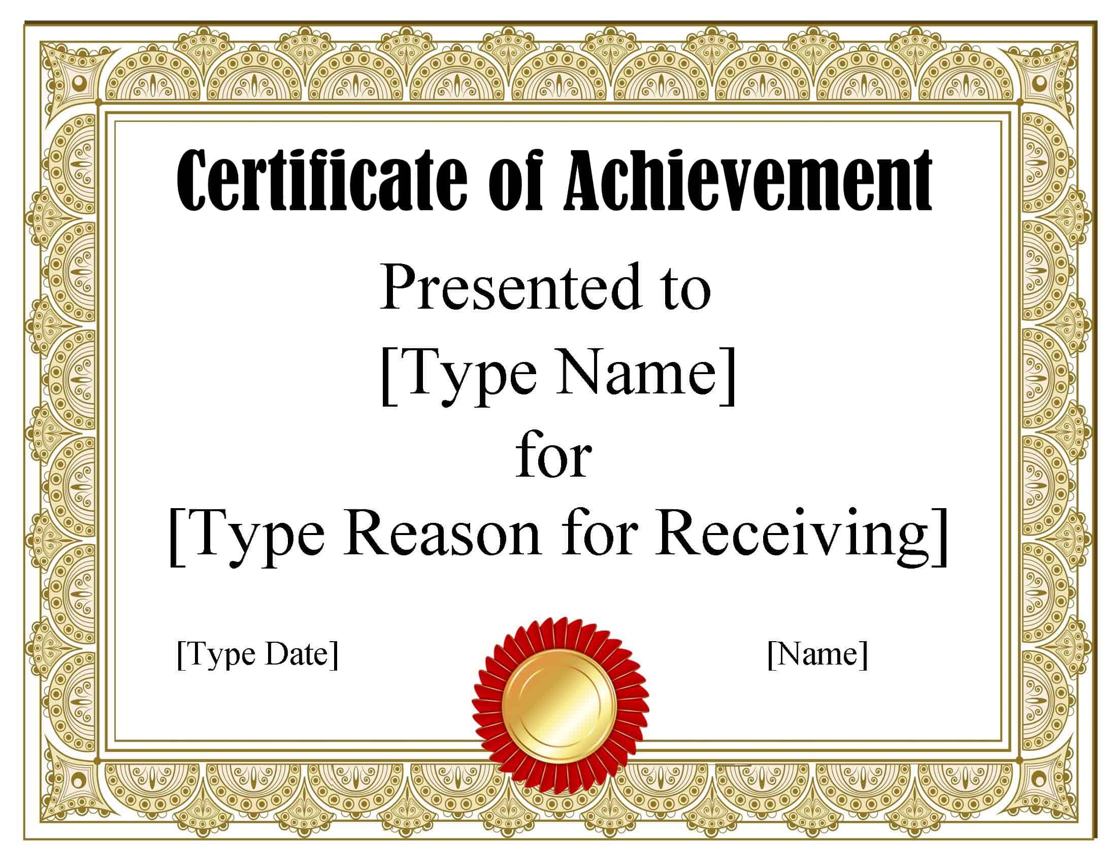
Visual elements and colors play a significant role in certificate design, adding visual interest and enhancing the overall aesthetic. Choose colors that align with the purpose and theme of the certificate. For instance, bright and vibrant colors can be used for a fun and playful event, while more subdued tones may be appropriate for a formal recognition.
Incorporate relevant graphics, such as logos, illustrations, or icons, to enhance the design. These visual elements can help convey the certificate’s purpose and create a unique and memorable look. However, be mindful not to overuse graphics, as it may lead to a cluttered and overwhelming design.
5. Include Essential Information Clearly

A certificate should contain all the necessary information to validate the recipient’s achievement or recognition. Ensure that the recipient’s name, the name of the organization or institution, and the date of achievement are prominently displayed.
Additionally, consider including a brief description or explanation of the achievement or the criteria met to receive the certificate. This adds credibility and provides a clear understanding of the recipient’s accomplishment.
6. Maintain a Consistent and Professional Look
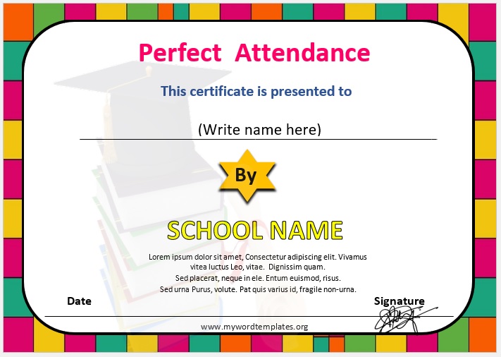
Consistency is key when designing a certificate. Ensure that the design elements, such as fonts, colors, and graphics, are used consistently throughout the certificate. This creates a cohesive and professional look.
Pay attention to the alignment and spacing of the text and visual elements. A well-aligned and balanced design enhances the overall visual appeal and makes the certificate more pleasing to the eye.
7. Proofread and Print with High Quality

Before finalizing your certificate design, proofread it thoroughly to ensure there are no errors or typos. Mistakes can undermine the credibility and professionalism of the certificate.
When it comes to printing, opt for high-quality paper and printing techniques. Consider using a thicker paper stock, such as cardstock or parchment paper, to give the certificate a more luxurious feel. Additionally, choose a reputable printing service to ensure accurate color reproduction and a professional finish.
Conclusion

Designing a certificate requires careful consideration of its purpose, target audience, and visual elements. By following these pro tips, you can create a certificate that is not only visually appealing but also effectively communicates the recipient’s achievement or recognition. Remember to keep the design simple, yet elegant, and ensure that all essential information is clearly presented. With a well-designed certificate, you can leave a lasting impression and celebrate achievements in a meaningful way.
Can I use multiple colors in my certificate design?

+
Yes, you can use multiple colors to add visual interest and create a unique design. However, be mindful of color combinations and ensure they complement each other. Too many colors may distract from the overall message.
What are some common mistakes to avoid in certificate design?

+
Common mistakes include using overly complex designs, cluttered layouts, and illegible fonts. It’s important to keep the design simple and ensure that all important information is easily readable.
How can I make my certificate more personalized?

+
Personalize your certificate by including the recipient’s name, a personalized message, or even a custom illustration or graphic that reflects their achievement or interests. Adding a touch of personalization can make the certificate more meaningful.
What if I want to include a lot of text on the certificate?
+
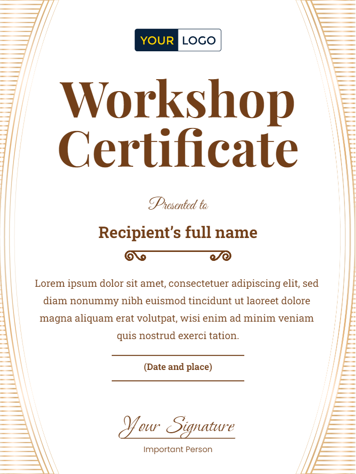
If you have a lot of text to include, consider using a smaller font size for less important information or breaking the text into paragraphs with clear headings. Ensure that the text remains legible and doesn’t overwhelm the design.
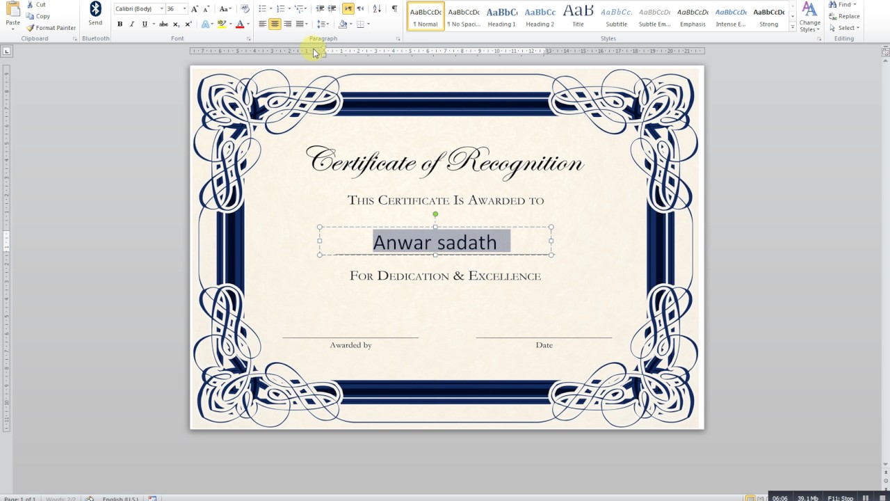
Can I use a template for my certificate design?
+
Yes, using a template can be a great starting point for your certificate design. However, make sure to customize it to fit your specific needs and preferences. Adding your own creative touches will make the certificate unique and special.


